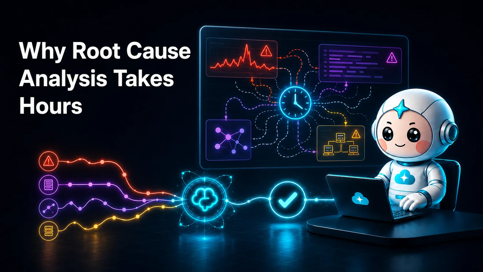
Why Root Cause Analysis Takes Hours: The 3AM Dashboard Correlation Problem
Your phone lights up at 3:11 AM. PagerDuty: [P1] checkout-api p99 latency above 4s for 10m. You're awake, sort of, and the clock on incident root cause analysis has already been running for a while. Latency started climbing at 2:52 AM, and it took nineteen minutes of breaching thresholds before anything decided to wake you.
What happens over the next few hours is remarkably consistent across companies, stacks and seniority levels. The page tells you a symptom. The cause is three systems away, behind six browser tabs, a grep session, two wrong hypotheses, and one Slack message to the only person who remembers how the payment service actually talks to Redis. This article, part of our complete guide to root cause analysis, walks through where the time goes during incident investigation, minute by minute, and why the tooling you already own is structurally unable to give it back.
None of this is a competence problem. It's an architecture problem. Dashboards were built to display state, not explain it, and the explanation you need at 3 AM lives in places no dashboard renders: the dependency graph and the change history.
The anatomy of a slow incident
Follow the checkout latency spike from detection to resolution, with typical time ranges for each phase. The ranges come from what on-call engineers consistently report. Your numbers will vary; the shape almost never does.
01Detection lag
19 min
Evaluation windows and a raised threshold delay the page.
02Context
24 min
Six tabs, six time axes, correlated by eye.
03Hypotheses
40 min
Three theories, two ruled out, one contradiction.
04Escalation
28 min
Finding and waking the one person who knows the topology.
05Fix
4 min
Roll back the mesh config. The part the incident was about.
Phase 1: Detection lag (commonly 5 to 20 minutes before the page)
The incident didn't start when you got paged. It started when the first user's checkout went from "slow" to "broken". Between those two moments sit several layers of deliberate delay:
- Evaluation windows. Your alert probably requires p99 to breach a threshold for 5 or 10 consecutive minutes. That window exists to suppress flapping, and it works, by eating minutes at the start of every real incident.
- Aggregation intervals. Metrics are scraped or shipped every 15 to 60 seconds, then rolled up. A regression that starts at 2:52 may not be visible to the alerting pipeline until 2:54.
- Threshold conservatism. After the last week of false alarms, someone raised the threshold from 2s to 4s. Reasonable. It also means the incident has to get twice as bad before anyone hears about it.
By the time your phone buzzes at 3:11, the outage is nineteen minutes old. Nothing you do from here recovers that time. Detection lag adds straight onto your mean time to resolution, and it's invisible in most retrospectives, which tend to start the clock at the page.
Phase 2: Context gathering, or the six tabs (commonly 15 to 45 minutes)
You're on your laptop by 3:16. Now comes the part every on-call engineer knows by muscle memory. You open, in roughly this order:
- PagerDuty, to acknowledge and read the alert payload, which tells you what you already know: p99 is high.
- The Datadog service dashboard for checkout-api. Latency is up, error rate slightly up, CPU and memory normal. No smoking gun.
- Grafana, because the database metrics live there, not in Datadog, for historical reasons nobody will fix. Postgres connections look elevated but not saturated.
- CloudWatch, because the RDS-level metrics (IOPS, queue depth) never made it into Grafana. You wait for the console to load. You wait again after it logs you out.
- The Kubernetes dashboard or a terminal, to see whether pods are restarting, being evicted or newly deployed.
- Slack, to check
#deploysand#incidentsfor anything that shipped tonight, and to see whether anyone else is awake.
Each tab has its own time axis, its own timezone handling, its own aggregation granularity, and its own idea of what "checkout" means as a label. You're now doing the core activity of incident investigation: manual cross-tool correlation. You put two graphs side by side and squint. Does the latency inflection at 2:52 line up with the connection-count bump at 2:49, or is that just how the rollup buckets fell?
This is unglamorous, expensive thinking, done on an interrupted sleep cycle. It commonly takes 15 to 45 minutes even for engineers who know the system well, more if the system is new to them, and much more if the relevant dashboard doesn't exist.
Phase 3: Hypothesis testing (commonly 20 to 60 minutes, often the largest chunk)
At 3:40 you have a working theory: something is slow between checkout-api and Postgres. You start testing. Each hypothesis follows the same loop (form a theory, gather evidence, discard or escalate), and each loop costs 5 to 15 minutes.
Hypothesis 1: a bad deploy. You check what changed:
kubectl rollout history deployment/checkout-api -n prod
The last rollout was 14 hours ago. Nothing shipped tonight. Fifteen minutes ago that felt like the obvious answer; now it's dead. Discard.
Hypothesis 2: the database is the bottleneck. You pull the slowest queries:
SELECT query, calls, mean_exec_time
FROM pg_stat_statements
ORDER BY mean_exec_time DESC
LIMIT 10;
The top offenders are the usual suspects, slightly slower than baseline, nothing dramatic. Postgres is stressed, not broken. It looks like a victim, not a cause. Discard, mostly.
Hypothesis 3: something downstream of checkout is timing out and backing up. You go to the logs:
kubectl logs deploy/checkout-api -n prod --since=60m \
  | grep -iE "timeout|connection refused|5[0-9]{2}" \
  | tail -50
There it is, repeated hundreds of times: redis: connection pool timeout against the cart-session Redis. Except you check the Redis dashboard, and Redis looks fine. CPU flat, memory flat, no evictions.
It's 4:20 AM. You've spent over an hour and you have a symptom (checkout slow), a proximate cause (Redis pool timeouts) and a contradiction (Redis is healthy). This is where most investigations stall, because the answer isn't in any dashboard you have. It's in the relationship between systems.
Phase 4: The tribal-knowledge lookup (commonly 15 to 40 minutes, plus one ruined night for someone else)
You need the person who knows how cart-session Redis is wired. The service catalog was last updated eleven months ago. The runbook says "escalate to the platform team." You search Slack for "cart-session" and find a thread from March where someone named Priya explained the failover topology.
At 4:31 you page Priya. She joins at 4:39 and asks one question: "Did anything change on the network path? There's an Envoy sidecar between checkout and that Redis. It's the only service that still goes through the old mesh config."
You had no idea that sidecar existed. It's on no dashboard, because nobody ever built one for it. Three minutes later: a routine node-pool upgrade (scheduled maintenance, announced weeks ago in a channel you're not in) recycled the node running that Envoy at 2:47 AM. The sidecar came back with a stale endpoint config and has been half-blackholing Redis connections since. Redis was healthy the whole time. The dashboards were telling the truth. They just weren't telling the story.
The mesh config is rolled back, connection pools drain, and latency recovers by 5:05 AM. Total user impact: a bit over two hours. Time spent on the fix: about four minutes.
Where the minutes actually go
Stack the phases and the pattern is stark:
| Phase | Typical range | What it looked like tonight |
|---|---|---|
| Detection lag | 5 to 20 min | 19 min (2:52 to 3:11) |
| Context gathering across tools | 15 to 45 min | 24 min, six tabs |
| Hypothesis testing | 20 to 60 min | 40 min, three theories |
| Tribal-knowledge lookup and escalation | 15 to 40 min | 28 min to find and wake Priya |
| Actual remediation | 5 to 15 min | 4 min |
The remediation, the thing the incident was nominally "about", is routinely under 10% of the total. Everything else is finding out what to remediate. If you're trying to improve mean time to resolution, this table is the whole game. MTTR is dominated by investigation, not by fixing, which is why a faster deploy pipeline or better rollback scripts barely move it. (We cover the levers that do in how to reduce MTTR.)
The table also hides the coordination cost. Every escalation resets context. Priya had to be briefed on everything you'd ruled out. Had she escalated further, the third person would have been briefed again, worse, at 5 AM. Long incidents don't only add time linearly. They add re-explanation.
Why dashboards show symptoms, not causes
It's tempting to conclude the fix is better dashboards: one more Grafana board, one unified pane of glass, and next time you'll see it immediately. Two structural facts about dashboards say otherwise.
Metrics are aggregates, and aggregates destroy causality
A dashboard panel is a statistical summary: p99 latency across all requests, connection count across all pods, error rate across all endpoints. Aggregation is what makes metrics cheap to store and fast to render, and it's exactly the operation that throws away causal information.
Tonight's incident is the canonical example. "Redis is healthy" was true as an aggregate: the Redis process served every request that reached it, quickly. The failure lived in one path (checkout pods, through one stale sidecar, to Redis), and that path isn't a dimension on any chart. The aggregate averaged the broken path together with healthy ones and reported "fine".
That's why you can stare at forty green panels while users can't check out. Green means "the summary statistic is within bounds". It doesn't mean "every path through this system works". Dashboards answer what is the state of component X. Incidents ask why does the interaction between X, Y and Z misbehave for this subset of traffic. Those are different questions, and no number of extra panels turns one into the other.
Causality lives in the dependency graph and the change history
When Priya solved the incident in three minutes, she used two data sources you didn't have:
- The real dependency graph. Not the architecture diagram from the wiki, but the current topology: which service talks to which, through which proxies and pools, with which failover behavior. She carried it in her head. That's what "tribal knowledge" is: a dependency graph stored in a person, with all the availability and bus-factor problems that implies.
- The complete change history. The trigger was a change (a node-pool upgrade) that never entered your investigation because it wasn't a deploy. Your instinct to check
kubectl rollout historywas right; your change feed was too narrow. Infrastructure maintenance, config pushes, certificate rotations, autoscaler decisions, feature-flag flips and dependency bumps: most incident-triggering changes live outside the deploy pipeline, scattered across systems that don't share a timeline.
You can see how narrow the deploy view is with one more command you probably didn't run at 4 AM:
kubectl get events -A --sort-by=.lastTimestamp \
  | grep -iE "NodeNotReady|Killing|Scheduled|Pulled" | tail -30
Node replacements show up here, not in rollout history. Most teams only look at it after someone like Priya tells them to.
Almost every production incident is the intersection of these two datasets: a change, propagating through a dependency, to a symptom somewhere else. The 3 AM correlation problem exists because neither dataset is rendered anywhere. The dependency graph lives in heads and stale wikis; the change history is split across six tools that don't know about each other. So a person (you, at 3:16 AM, with six tabs) becomes the join engine.
People are bad join engines at 3 AM. Not for lack of skill, but because the join is mechanical work across large, fast-changing datasets, which is exactly the work people shouldn't be doing under sleep deprivation and time pressure.
The pattern behind every long incident
Strip away the specifics and tonight's incident reduces to four gaps. Every hours-long investigation you've lived through maps onto the same four.
01Detection
Late page
The system knew double-digit minutes before you did.
02Correlation
Joined by hand
The evidence existed across tools, and you lined it up by eye.
03Topology
Unrendered path
The cause ran through a sidecar no dashboard showed.
04Change visibility
Not a deploy
The trigger was maintenance, so it never entered the search.
- A detection gap: the system knew before you did, by double-digit minutes.
- A correlation gap: the evidence existed across tools, but nothing joined it, so you joined it by hand.
- A topology gap: the causal path ran through a component no dashboard rendered and only one person remembered.
- A change-visibility gap: the trigger was a change that never entered your investigation because it didn't look like a deploy.
More dashboards close none of these. More dashboards are the correlation gap: every new pane is one more tab in Phase 2, one more time axis to reconcile by eye. What closes the gaps is the join itself. Something that continuously correlates events across your existing tools, walks the live dependency graph and overlays the full change history, so the 3:11 page arrives already attached to "node-pool upgrade at 2:47, stale Envoy config, Redis pool timeouts, checkout p99".
That's a data problem with a data solution, and part two of this series shows how far you can get building it yourself.
Why correlation beats more dashboards
| Dashboards plus an on-call engineer | Continuous correlation | |
|---|---|---|
| Change feed | Deploys, if you remember to look | Deploys, node upgrades, config pushes, flags, on one timeline |
| Dependency path | In one person's head | Walked on a live graph, including sidecars and pools |
| Cross-tool join | By eye, across six time axes | Done before the page lands |
| Escalation | Re-brief every new person | The thread already holds what was ruled out |
| First page at 3:11 | A symptom | A symptom with a likely cause attached |
The deeper difference is who does the join. Dashboards leave it to a tired person working from memory. A correlation layer does it continuously, against the dependency graph and change history no dashboard renders, and leaves the person with a decision.
The way out is correlation, not more dashboards
That join is what CloudThinker Resolve runs continuously. It detects anomalies, triages severity, correlates related events across Datadog, Grafana, Prometheus, PagerDuty and CloudWatch, traces impact paths on a live dependency graph, and proposes remediation runbooks with a full audit trail. The investigation you did by hand at 3 AM arrives already assembled.
What it's allowed to do about it goes through Auto Mode, so you decide what runs on its own and what waits for approval. In tonight's incident, the page arrives with the finding and a proposed mesh-config rollback.
If you want to try it on your own incidents, ask in plain language:
"checkout-api p99 has been above 4s for ten minutes. Correlate everything that changed in the last two hours (deploys, node events, config, autoscaling) with the dependency path for checkout, and tell me the most likely cause. Propose only, change nothing."
"For last week's three longest incidents, show how long each phase took and which change triggered each one."
In part two, we cover building DIY incident-response runbooks first. Or start now: try CloudThinker free with 100 premium credits and no card required.